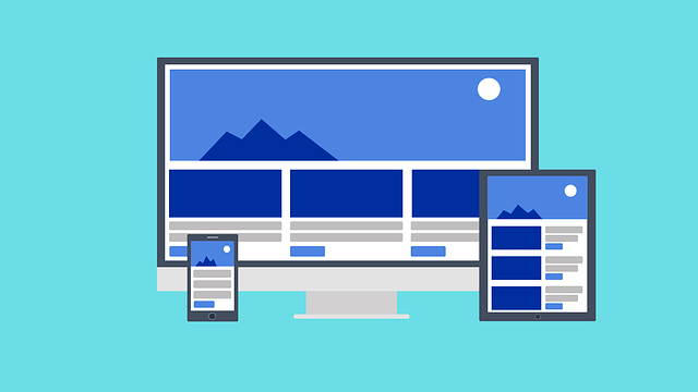
What is Dark Mode?
In recent years, more and more web developers have been adding an option of ‘dark mode’ for their users — a supplemental mode that can be used to display mostly dark surfaces on user interface (UI). This theme is an inversion of the standard bright settings most website’s default settings use, instead reducing the amount of light emitted from screens and applying the minimum color contrast settings in order to minimize eye strain. Instead of the traditional appearance of text-based UI, which mimics the appearance of pen on paper with a dark-colored text on a white background, dark modes typically utilize a black or grey primary background color and light colored text for contrast.
Dark mode is actually nothing new. The idea of a ‘dark mode’ may conjure up images of the first computers from the 80s, where a black background with green computer code raining down the screen reigned supreme. In 2021, the classic dark look has gone through a rebrand and is coming back in full force!
As we continue to expose ourselves to screens and usage of mobile devices continues to increase, many social media companies and web developers have seen the merit in providing dark modes for their users because of dark mode’s positive ergonomic effects on minimizing eye strain. And in fact, this UI is highly popular. A survey published on Medium showed that 82.7% of participants had used dark mode on their devices.
Snapchat, Twitter, Facebook, Instagram, and other social media platforms now offer a dark mode for their users to toggle at will. Many dark modes are responsive to light condition changes, adjusting brightness settings as users transition to night or dark environments.
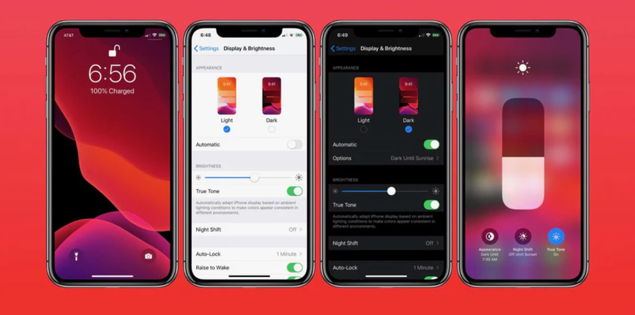
In 2016, Apple introduced a night shift mode that could be triggered with a timer setting. As the day transitions to night, users could toggle the ‘Night Shift Mode’ which uses the iPhone clock and geolocation to adjust display settings to the warmer end of the spectrum, making phone usage easier on users’ eyes. In 2021, both Androids and iOS systems now offer dark mode options that can be applied system-wide at . These system-wide dark mode UI modes allow users to experience the entire operating system of their mobile phones in a black background, including all compatible mobile apps.
Here are some pros and cons of using Dark Mode in your designs.
What are the Benefits of Dark Mode?
Limited Eye Strain
We’ve all experienced the effects of staring at a computer screen too long. After a long 8-hour shift of staring at excel spreadsheets and email inboxes, you may start to feel a slight headache and stinging eyes. Computer Vision Syndrome, otherwise known as digital eye strain, refers to the group of eye- and vision-related problems that a user might incur after spending too much time staring at computers, tablets, smartphones, or e-readers. Dark mode can help mitigate this pain.
Energy Conservation
Dark modes have shown to save energy, especially if it utilizes an OLED (organic light-emitting diode) or AMOLED screen. OLED displays do not require an external extra backlight to illuminate pixels, unlike their LCD counterpart which was used in most smartphones made more than 5 years ago. Instead, the OLED display’s pixels produce their own light. This allows developers to design user interfaces that utilize darker colors in order to make their software more energy-efficient. OLED screens allow for devices to switch off black pixels when they are not being used, and the increased use of black pixels in dark mode can force devices to use less energy.
However, recent studies have shown that this difference is not particularly high — researchers at Purdue University only found a 3 to 9 percent difference in battery saved, comparing dark mode to auto brightness. This percentage is so small users may not notice the slightly longer battery life.
Sleek, Luxurious Design
If your brand represents more sophisticated, dramatic, or elegant digital products, a darker, shadier format might be a great way to communicate your brand’s identity. Black is associated with power, mystery, and elegance, and this will shine through in a dark UI. You may want to consider a dark UI if you sell luxury products, nighttime entertainment, or other services that lend themselves well to dramatic web design. However, because dark color schemes can be so polarizing, it may be a good move to allow users to make the choice for themselves whether they would like to view your website in dark or bright mode.
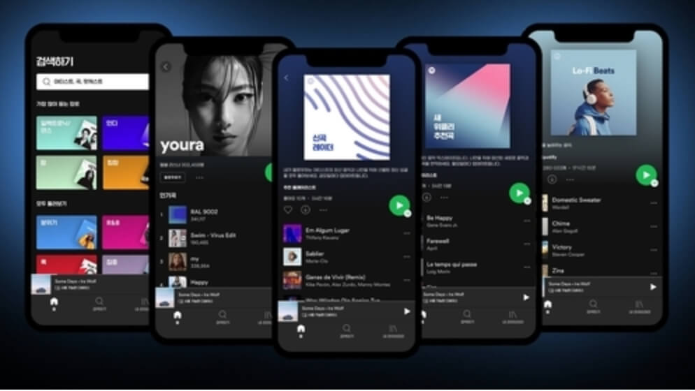
Spotify has been leaning in to a darker theme lately.
What are the Drawbacks of Dark Mode?
Including dark mode can have its drawbacks, depending on the design setting it is used in.
Reduced Emotional Connection
Bright colors and design elements elicit emotional connections in the beholder. Color theory dictates that colors can help create desired emotions that you would like your customers to experience. Users may have a more difficult time connecting with your design layout if you utilize a dark theme, which mostly encompasses gray, and black design elements. Depending on the nature of your brand, this sort of more formal and emotionally-detached aesthetic may be harmful to communicating your brand identity.
Readability
Dark mode UI can be a bad decision if you are dealing with data heavy projects, or generally complex design elements that incorporate a variety of content types. It can be challenging to ensure that your design is reading properly with dark mode, because it relies on minimal contrast. This can be a challenge for readability if you have a particularly complex design layout, or your website contains a lot of text.
For text-based design, the rule of thumb is that black on a white background is the most readable format. A high contrast ratio between text and background is absolutely paramount to successful design, and you would not want your website to encounter accessibility problems because of its poor readability. The Web Content Accessibility Guidelines (WCAG) recommend a minimum contrast ratio of at least 4.5:1. On the other hand, extreme contrasts between text and background can actually increase eye strain, so make sure your dark mode design utilizes a balanced color contrast that is easy to read without being overly dramatic to the point of straining.
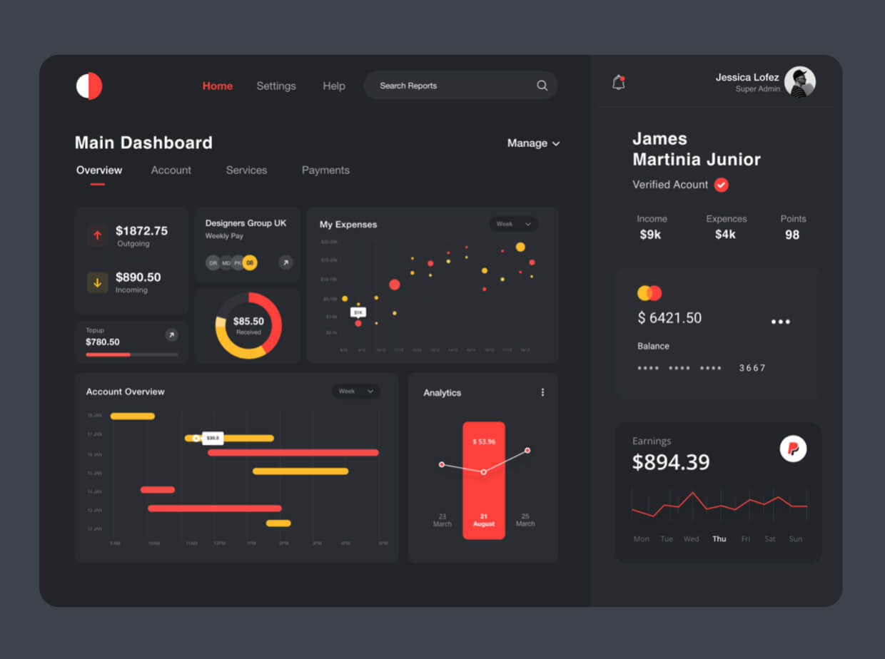
This is an example of difficult to read dark UI. Complex reports with charts and graphs might be better presented in a bright mode format.
Data tables, widgets, forms, dropdowns, and other analytic design elements that may be used in dashboards or annual reports can be very tricky to develop on a dark UI. Poor contrast can make these elements look odd and overwhelming to a user.
Make sure to weigh all these pros and cons before deciding whether you want to provide a dark UI design for your website. Dark themes can be a great way to elevate your brand identity for some digital products, but may pose a significant challenge to readability and communicating the right ethos to your clients if your brand is a more soulful, youthful, or playful one. They may be a poor fit for complex, data-heavy platforms, or ones that contain a high level of text content that may overwhelm viewers in a dark mode format.
However, given the rising popularity of dark mode and its perceived positive effects on energy and limiting eye-strain, you may want to turn to the ‘dark side’ and provide your users with the option to switch to a dark mode.