Why Should I Care About a Mobile Site?
In 2021, mobile web design is essential. Mobile devices have completely revolutionized the way we connect with each other, and as a result, changing the entire business game. Most people are now foregoing the laptop or desktop computer and opting for their smartphones to surf the web. In fact, nowadays, the majority of web traffic comes from mobile devices. For example, recently Google has updated their algorithm to favor websites adapted for mobile devices and penalized non-mobile optimized sites, which now appear at the bottom of search results. You can test the mobile-friendliness of your site with Google’s tool here.
It’s clear that in today’s day in age, a mobile site is necessary for all businesses. But what makes good mobile web design?
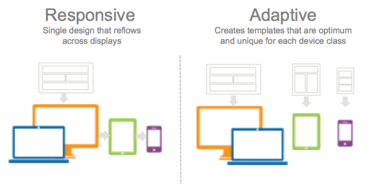
What is the Difference Between Responsive and Adaptive Design?
Ultimately, there are two types of effective mobile site designs: responsive and adaptive. Responsive design takes your existing website design, and fits it to expand or shrink depending on whether the user is viewing it on a mobile or desktop platform. Responsive design uses CSS media queries to adapt to whatever screen the user views your website on. Conversely, adaptive design is much more like having two separate websites: one for desktop, and one for mobile. It has multiple fixed layouts. Adaptive layouts are static, and do not respond once they’re initially loaded. They detect screen sizes, and load the appropriate version of the website to fit the screen.
There are pros and cons to each type of design. Here is a rundown of the difference between the two.
Adaptive Design
Adaptive design allows you to have complete creative control over your fixed layout viewports. Amazon, USAToday, and Apple.com each have adaptive fixed layouts for their mobile and desktop designs. It is up to you and your company’s budget to design how many screen widths you would adapt your website to, but it is standard practice to develop six for the most common screen widths: 320, 480, 760, 960, 1200, and 1600 pixels. It can be quite labor intensive and time consuming to adapt layouts for each resolution, so often for adaptive design, retrofitting is used.
Adaptive design provides tailor-made solutions to each of your site visitor’s specific wants and needs. Instead of using code to shrink or enlarge images or content to fit screens, pre-made versions of your site for each screen width allow for great quality control and ensure that your content always looks in top shape. With adaptive design, you can also create custom advertisements that best speak to whatever platform your user is browsing your website on. Smartphones nowadays allow for behavioral targeting that takes into account browsing habits like search terms, sites visited, purchases. With adaptive design, you can design versions of your website that capitalize on these insights based on the type of device your user is visiting your site with.
Another advantage of adaptive designs is that they typically take much less time to load than responsive designs. Adaptive websites are typically 2-3 times faster than responsive ones. This makes a huge difference in the mobile world, where people’s attention spans are very limited.
Responsive Design
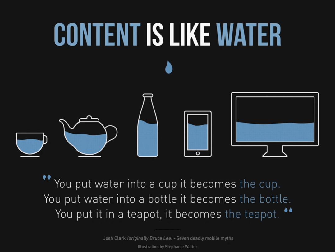
Responsive design is much less labor intensive than adaptive design, because you would use coding to automatically fit your website design to fit different screen widths. It takes much less time to build initially, and to maintain. Responsive design is also much more fluid and the scaling process will appear much more seamless as your website changes to fit skinnier or longer screens respectively. If the design of your website is relatively simple, the content of your site should be able to adapt from screen to screen as fluidly as liquid fills different containers.
However, responsive design can be costly, and if the CSS media queries are not coded correctly, you can end up with display and performance issues. It requires much more in the way of coding in order to make your website design fit to all types of resolutions and screens. On the other hand, adaptive design is not completely free of coding – good knowledge of HTML and CSS code is necessary to develop each individual layout. Additionally, just adapting your website to respond to different sizes to make sure everything fits on a page is not enough. It is essential to ensure that your website is usable on all screens.
Another argument for responsive design is SEO. Most responsive designs are more search-engine friendly, and in fact, Google recommends responsive design for the best mobile hits for your website.
So, Which One is Right for Me?
If your company has the budget, adaptive design is preferable to responsive. Although it is more costly and time consuming to maintain, adaptive design allows you full creative and quality control over the different versions of your website. However, more and more companies are opting for responsive design – indeed, nearly ⅛ websites use responsive design as of today. It is easier and takes less work to implement. Cheap templates are also available offering responsive design on Content Management Systems (CMS) such as WordPress.
