As they say, a picture is worth a thousand words. In fact, the human brain processes images 60,000 times faster than it processes text. Conveying information through images, icons, and illustrations can be a useful way to communicate ideas, especially on your website. Animations, graphs, plots, and charts can bring dry data information to life with verve and attention-grabbing visual flair. Both data visualization and infographics are effective means to visually express data, however, they are discrete.
Here are some key differences between data visualization and infographics.
Data Visualization:
Some good examples of data visualization are Newsletters, White Papers & eBooks, Annual Reports. They are much more simple than infographics, simply focusing on single sets of statistics, or answering a single question with one straightforward graphic. They are also typically interactive. The user can interact with data visualization. For example, some data visualization allows the consumer to hover over the graphic with their mouse to reveal information.
Typically, it is up to the user to draw their own conclusions from data visualizations. They are more static and present simple present information in a visual form, without injecting meaning into the data. This is why they are well suited for Annual Reports, or a pie chart distribution of raw sales numbers.
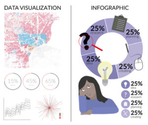
Infographics:
Infographics are almost never interactive. They are also used to tell a story to guide the user to the story you are trying to tell. Whereas data visualization simply presents data, infographics are much more subjective – they are used to tell a narrative.
Infographics can contain data visualizations, like charts, graphs, blurbs or quotes, but ultimately these visualizations are weaved together to tell a story.
Infographics are best suited for marketing content, conveying company values, blog posts, and case studies. When marketing content, your company can utilize infographics to tell a narrative about your product on social media.
Ultimately, both data visualizations and infographics can be invaluable tools to make complex datasets digestible and intuitive to comprehend. They can be a great asset for your business to sell your products or promote a service your business performs. It’s important, however, to select the right way to present your visual information.